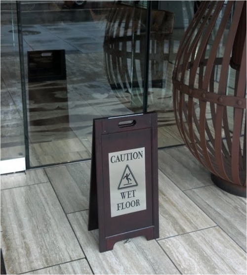
Attention to Brand Details: St. Regis Style
This is the classiest “Caution: Wet Floor” sign ever.

During lunch today, I went to check out the St. Regis hotel for an upcoming work conference that I’m planning.
Not surprisingly, the hotel is impeccably designed. Every detail in the place – the minimalist flower arrangements, the clean lines of the furniture, the stainless steel lettering designating each conference room – was carefully thought out to create a brand that embodies modern glamor.
Yes, they even turned a tacky plastic yellow “Caution” sign into something chic, something worthy of being seen in the hotel. Most brands pay attention to details but rarely to this extent.
As a marketer, you have to ask if going to this level of detail is worth the investment. Would most people even notice? Would they care? Probably not.
But the St. Regis knows that their customer is choosing to pay more than they could elsewhere in order to be immersed in an experience. You might shop in a retail store for an hour or two maximum, but when you stay at a hotel, you spend a significant amount of time in the space – eating, bathing, meeting, sleeping. Hotels offer a continuous brand touch point which can be amplified or ruined at any point of the customer’s stay by the smallest details.
The amount of value a brand places on details depends on many things, including your industry, market positioning, customer demographic, etc. For example, a J.Crew customer may be delighted by mother-of-pearl buttons on a cardigan, but an Old Navy customer might be happy with plastic buttons, as long as the price is right.
So no, the average person might not notice or appreciate an elegantly designed “Caution” sign. But the St. Regis isn’t going after the average customer.
Follow me on Twitter: https://twitter.com/winniekao