Blondes in bras
Here are some lessons from the masters of sexiness based on the Victoria’s Secret online brand experience.
1. Invest in photography - Sexiness is visual online, so photos are important. Pictures vary with models, poses, backgrounds, etc.
2. Use blonde models - Regardless of how you filter, ~80% of the first 4 pictures that show up are of blondes.
3. Offer search filters that enhance the brand concept - “Supermodel essentials” or “Holiday Lingerie Shop” offer a story beyond functional search requirements.
4. Showcase expertise - “How to measure cup size." Gain customer trust by sharing knowledge without trying to sell your own product.
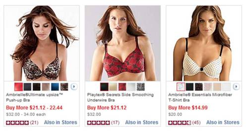
5. Lure them in first - See below screen shots.
For each product thumbnail, Victoria’s Secret lets the jaw-dropping photos take center stage. By contrast, JCPenney muddies the message with the promo offer, available colors, and customer rating.*
* To be fair, JCPenney has to be consistent with the rest of their website formatting. It also isn’t a specialty retailer for lingerie and has a different target customer. Then again, their website doesn’t make me want to buy their bras, so the above insights are still applicable.
Take-away: Everything you do should focus on what your brand stands for. Victoria’s Secret is, in a word, sexy.
What is your brand concept in one word? How are you blowing it out?


