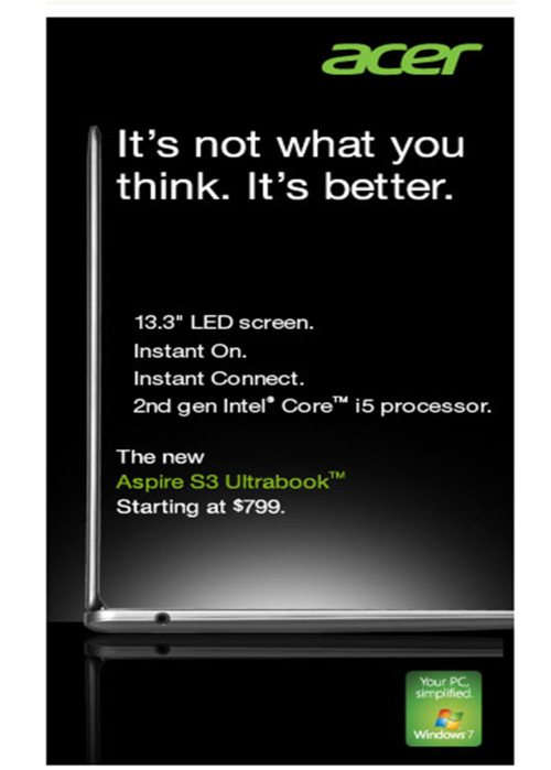
How many things are wrong with this ad?
Once upon a time, creatives took pride in their work.
Now you see ads like this floating around on desktop and mobile. Acer is the fourth largest personal computer vendor in the world with $16 billion dollars of revenue in 2011.
Was it really that hard to find a designer who could left-justify the text here? And the little Windows 7 icon in the bottom right makes the ad precariously top heavy. Don’t get me started on the message - “It’s not what you think. It’s better”?
It’s a lot easier to publish digital work and to fix mistakes, compared to the high-stakes nature of print ads that required months of lead time.
But just because it’s easier to fix mistakes, does not mean you should push sloppy work out the door. If the ad is going to have a net-negative effect on how the audience sees your brand, you might as well save your money and not run the ad at all.
