You can do better


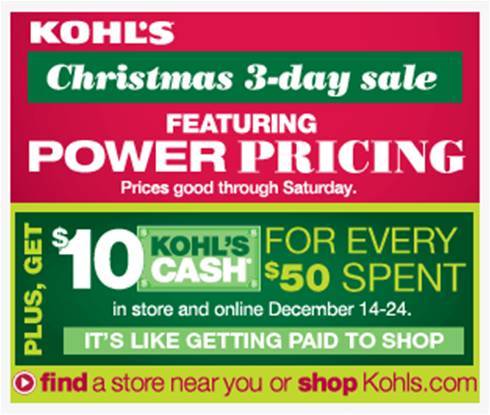
Last week, I wrote about a terrible Kohl’s banner ad. Imagine my horror when I saw these today. I didn’t think it could get worse, but I was wrong.
The aesthetic elements are so sloppy that it disrupts messaging clarity. Kohl’s, please stop using so many fonts and random formatting. Your ads are confusing enough as is.
Someone with a Creative background, please confirm that I’m not crazy and that these ads really do suck.